/ PROJECT
Packaging
/ CONCEPT
I created designs that would remain a flexible system while incorporating key attributes that represent the Dollar Tree brand. The challenge was setting up a key color palette and modifying the typography of each product name to give a unique contrast to what is currently on the market while also keeping the nature of the designs in compliance with client requirements.
Feel free to check out the links below on Dollar Tree’s site
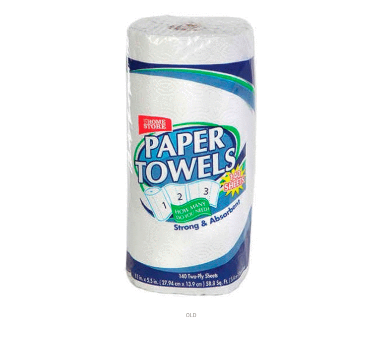
Paper Towels
Napkins
Foam Cups
*Due to the legal approval process, not all packaging materials have been publicly released. I am showing only what has been released and reserving the remainder for in-person presentations.